Mask fields


The application has a large number of different mask fields and field types whose functions and characteristics are explained in the table below:

If you want to get to know the application by means of examples and step-by-step instructions, see section Using the application.

Field type

Description

Input field, for example,

Input field for data

When saving and when quitting the mask, it is checked whether all mandatory fields are filled. A corresponding message is displayed.

Note:

Mandatory fields are always marked with a *.

Note on amount fields:

The operator of your application can define for amount fields in which format thousands separators and decimal separators are displayed in an amount field (The functionality is not included in the standard scope of the application.).

Display field, for example,

Display field with too much content

Displays data for informational purposes only

Empty fields are filled with 2 hyphens (--).

If a field contains so much text that it cannot be fully displayed, ellipsis points are appended at the end of the display area. Placing the cursor over the text will display the full field content as a tooltip.

Selection list; for example,

Selection list for selection of individual elements

You have the following options:

Drop down the list and select an entry from the list.

The highlighted element indicates your current selection which is applied when you leave the field.

If a line in the selection list contains more than one entry, the list is displayed with multiple columns.

Enter characters in the list's input field.

The characters you have entered are compared to the existing entries from the list and displayed for you. The list is interactively adapted to only display the values that match the characters of your input.

Select an entry from the (adapted) list.

In some selection lists, you can either select elements from the list or create an element in the list field if it is not in the list yet.

You can recognise such lists by the button for expanding, which shows three dots instead of an arrow.

Proceed as follows:

a)

Enter characters in the list's input field.

If your entered character string is found in the list, they results are displayed for you.

b)

To apply an element from the list, select the element.

c)

To apply your own entry (and not the displayed entry from the list), press [ ENTER ] or leave the list field.

Your entry is not permanently added to the list.

Multiple-selection list

Selection list for selection of individual or multiple elements

You have the following options:

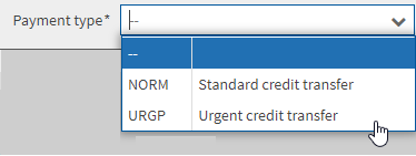
You can drop down the list by using either the mouse or the [ CTRL ] key.

Select an entry from the list. The highlighted element indicates your current selection and is applied when you leave the field with [ ENTER ] .

You can repeat this action.

Enter characters in the list's input field.

The characters you have entered are compared to the existing entries from the list. The list is interactively adapted to only display the values that match the characters of your input.

Select an entry from the (adapted) list.

You can select elements from the list by using [ ENTER ] or [ , ] (comma) as separators.

Proceed as follows:

a)

Enter characters.

The list is adapted and the first match is selected.

b)

Select the required element via mouse click or press the separator.

The element is added to your selection.

To delete a selection, you have the following options:

Click on the cross behind the selected element.

If the cursor is placed in the input field, you can use the [ ARROW TO THE RIGHT ] or [ ARROW TO THE LEFT ] keys to navigate to the selected element and delete it with the [ DEL ] or [ BACKSPACE ] key.

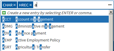
In some selection lists, you can add own elements. You can recognise such lists by the button for expanding, which shows three dots instead of an arrow.

Proceed as follows:

a)

Enter your value in the list.

b)

If the value does not exist in the list yet, the following button is displayed: Create a new entry by selecting ENTER or comma.

c)

Click the button.

Your value is added to the list.

Radio button

Group of round, labelled selection fields of which you can only select one

Selection field for individual functions

Selection field for function groups

Yes or no selection field for functions

You activate or deactivate individual functions or group of functions.

For individual functions the selection field is followed by the name of the function.

If various functions are combined in a group, the number of activate functions and the total sum of all functions that can be activated are displayed. In the detailed view you can activate or deactivate the individual functions.

The field knows the following states:

Empty: no function is activated.

Filled with a box or greyed out with a tick: at least one of the group's functions is activated.

Note:

The representation depends on your used browser.

Filled with a tick: the function is activated or all functions belonging to the group are activated.

Password field

Input field for the password

The individual characters you enter are not visible but are displayed as dots.

Date field

Field to enter or select a date

You have the following options:

Enter a date using the country-specific format:

e.g. DD.MM.YYYY for German GUI

e.g. YYYY-DD-MM for English GUI

Note:

The application tolerates deviating formats provided that an unambiguous date can be formed: If you, for example, enter 4,4.12, the application automatically sets the date to 2012-04-04.

Click the calendar icon. A window opens in which the way you can select a date is identical to that of a calendar.

Note:

If not all dates of the calendar page can be selected, the application has already limited the dates to only those that are available.

Search field

Input field for search items

Please note the following information when performing a search:

The search function interactively reacts on your input, i.e. the mask content is immediately checked for matching results and is updated accordingly.

If you enter several search terms, they are linked with AND.

Use double quotation marks ("") around the terms to keep them together.

Example: To search for the exact phrase Deutsche Bank Frankfurt, enter "Deutsche Bank Frankfurt" into the search field.

You do not have to confirm your input in the search field.

The search refers to the displayed mask content.

You cannot use wildcards.